Design System
Scaling design for Digital Marketing while creating a stronger design-to-dev pipeline.
As the Digital Marketing team at Safe Software was continuing to grow and more work was coming in, the team needed to take a systems approach for the future. I was able to advocate and lead the creation of the first design system at Safe Software. Collaborating with a junior UX/UI Designer (the talented Brendan Chow), we created a fully-realized system.
Role: Project lead, communicating high-level updates with stakeholders. Guide overall visual direction and collaborate on creating components, guidelines, and spacing systems.
Company & Year: Safe Software, 2021
Status: A few elements are live such as colours and spacing, however project scope has expanded to include the web products of the FME Platform.
Foundation: Redefining Colours Through Intent
From 2020 to early 2021, I was able to lead a project to redefine Safe Software’s colour palette. Collaborating with two designers from other product teams, we set out to audit all of the existing colours, remove colours that were one-offs, most likely from lack of guidelines for developers,
and propose a new, consolidated, modernized palette.
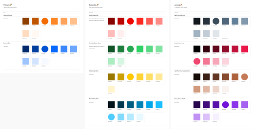
We were able to take 222 individual, unique colours and consolidate them into 102. Still a large number, but ongoing efforts are being made to reduce this further. We presented this to the co-founders, marketing team, product, and developers. We also created robust guidelines on usage and a systematic way to select colours.


Design System Kickoff & Auditing
Prior to getting started, I mapped out the project journey in Jira, helping us (designers) stay aligned and work better with product and developers. After that, we broke down the why behind the design system. We researched extensively, looking at existing design systems and why and how they worked, as well as looking back at the colours project.
This research gave us the basis for creating a north star, an area in the design system designers and developers could look to for a guiding voice. Every decision made was to support the north star. Once we had an agreement there, we conducted an audit of the existing components, capturing where and why they exist.

Layout Spacing and Colour
Once we’d completed the audit, we began by solidifying the foundational pieces of what would make up our components, spacing and colour. We researched spacing systems, collaborating closely with front-end developers to see what works best. We found for our product, a system of 4px works best to give us more flexibility and consistency.
As we were using Figma for this entire project, to make our lives easier, we converted our colour palette into a reusable Color Style, this also led us to determine a consistent naming convention.

Component Creation
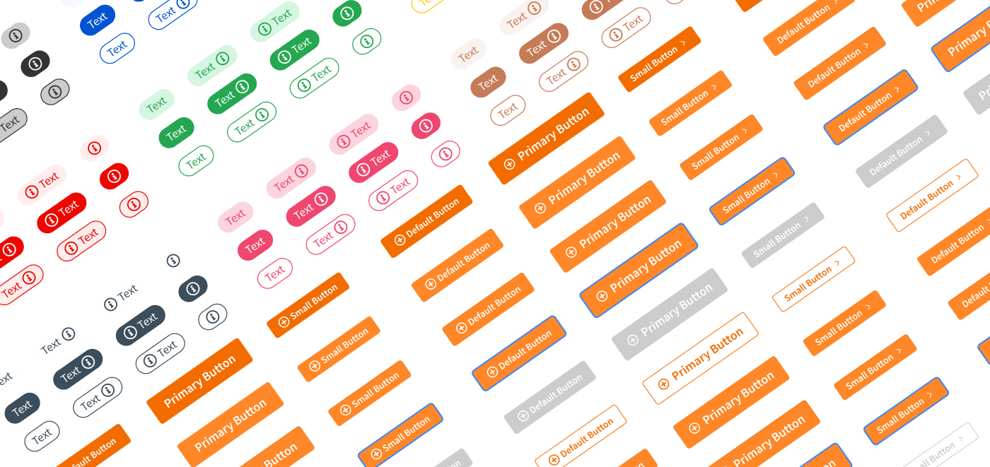
During the audit phase, we also took the time to determine what components could be removed, kept as it is, or needed to be modified. With our overall visual direction for our components, we wanted a timeless look that wasn’t falling into trends. This meant each component needed to have sound user interface principles and a minimal look with little decoration.
What helped with determining our overall visual direction was again, marketing research, and close collaboration with marketing to understand the brand direction they were moving in. We also knew our users/visitors were GIS, technical specialists who came with very specific goals in mind and didn’t near frills.
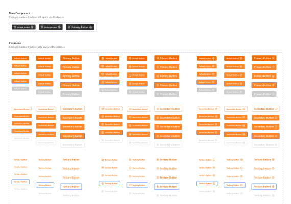
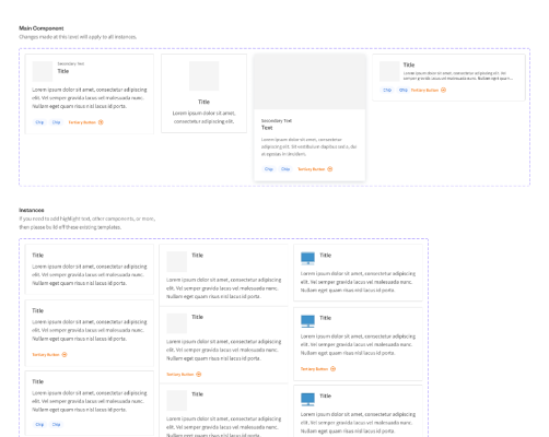
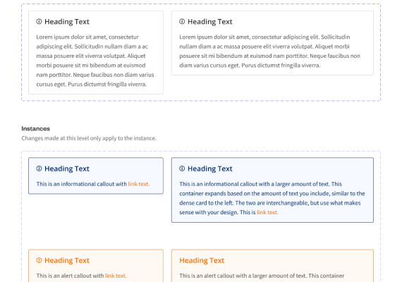
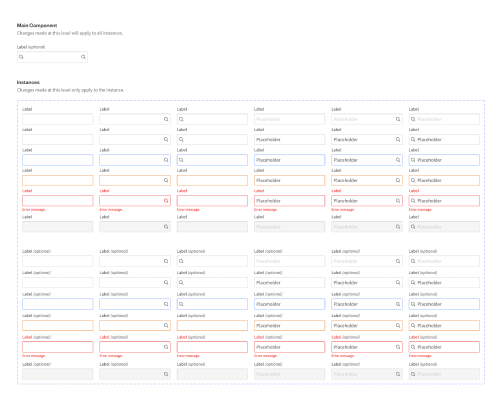
All of the components were created using Figma design system features, including master components, variations, and auto layout. This helped us future-proof our system in case we needed to make adjustments and allowed us to proliferate changes to files without manually making changes one by one.
Guidelines & Collaboration with Development
During the component creation stage of the project, we frequently presented to developers for feedback. This helped us understand technical feasibility and their own process for creating reusable components. One area that stood out was the lack of clarity on how, why, and where components should be used.
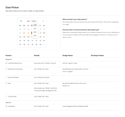
To help reduce confusion on component usage, we created guidelines for each component. We tried to strike a balance between reducing ambiguity but also keeping usage flexible so as not to lock ourselves our of creativity and exploration.

